TRAVELNEST

CLIENT
Startup
SECTOR
Travel
eCommerce
ROLE
Product Designer
TravelNest is reinventing the way owners market their vacation rental properties. Their innovative software solves the problem of low occupancy in the vacation rentals market and turns unsold dates into guests.
There is more than creating a good product
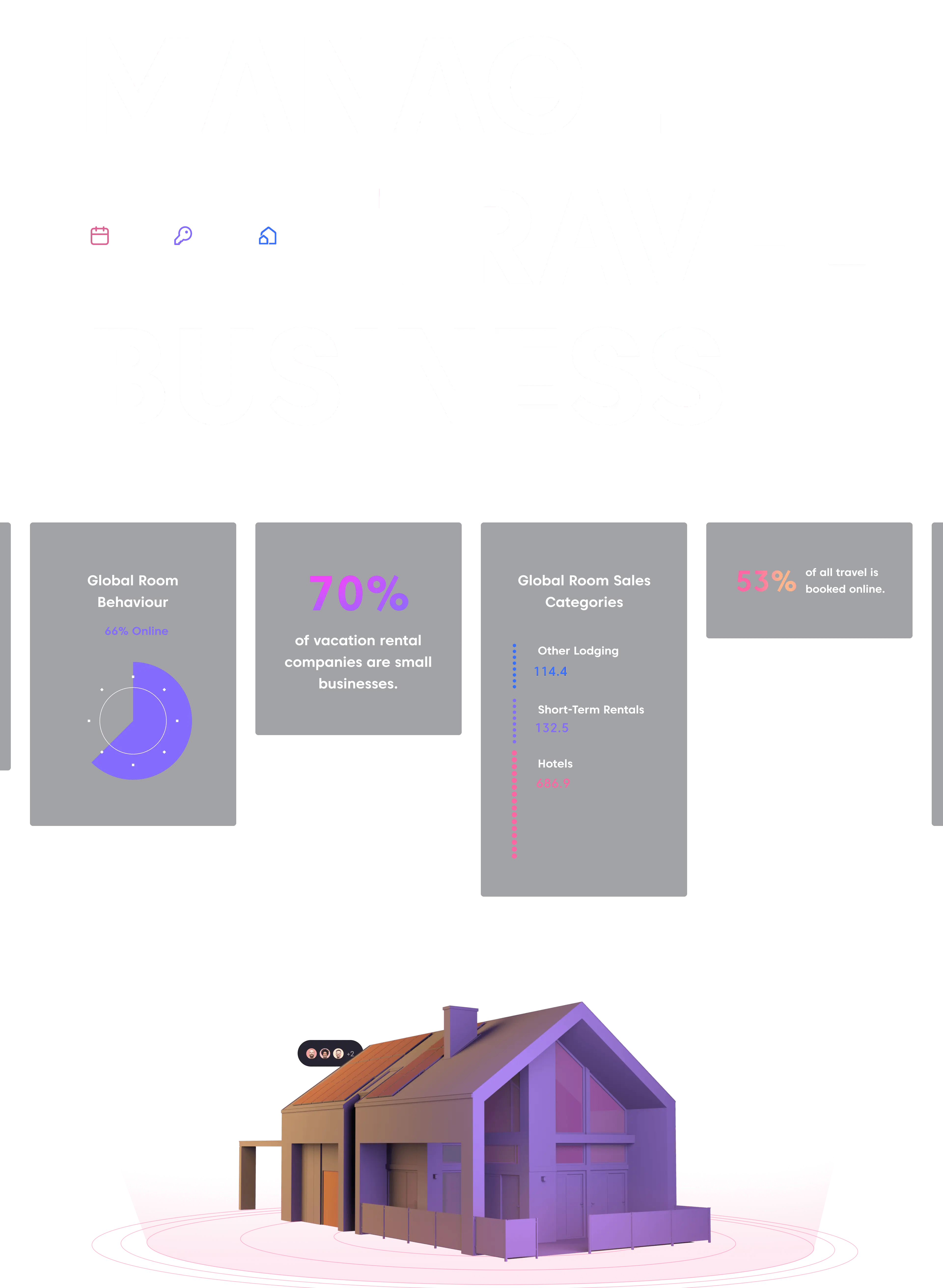
Travelnest, a pioneering software solution in the vacation rentals market, has garnered significant attention for its innovative approach to addressing low occupancy rates. Designed to transform vacant dates into occupied ones, the Travelnest solution has become an invaluable resource for property owners and hosts worldwide.
The startup aspires to be the premier platform for vacation rental hosts, offering an array of exclusive features. These include a comprehensive property database, a user-friendly booking managment tool, and calendar optimization tools.
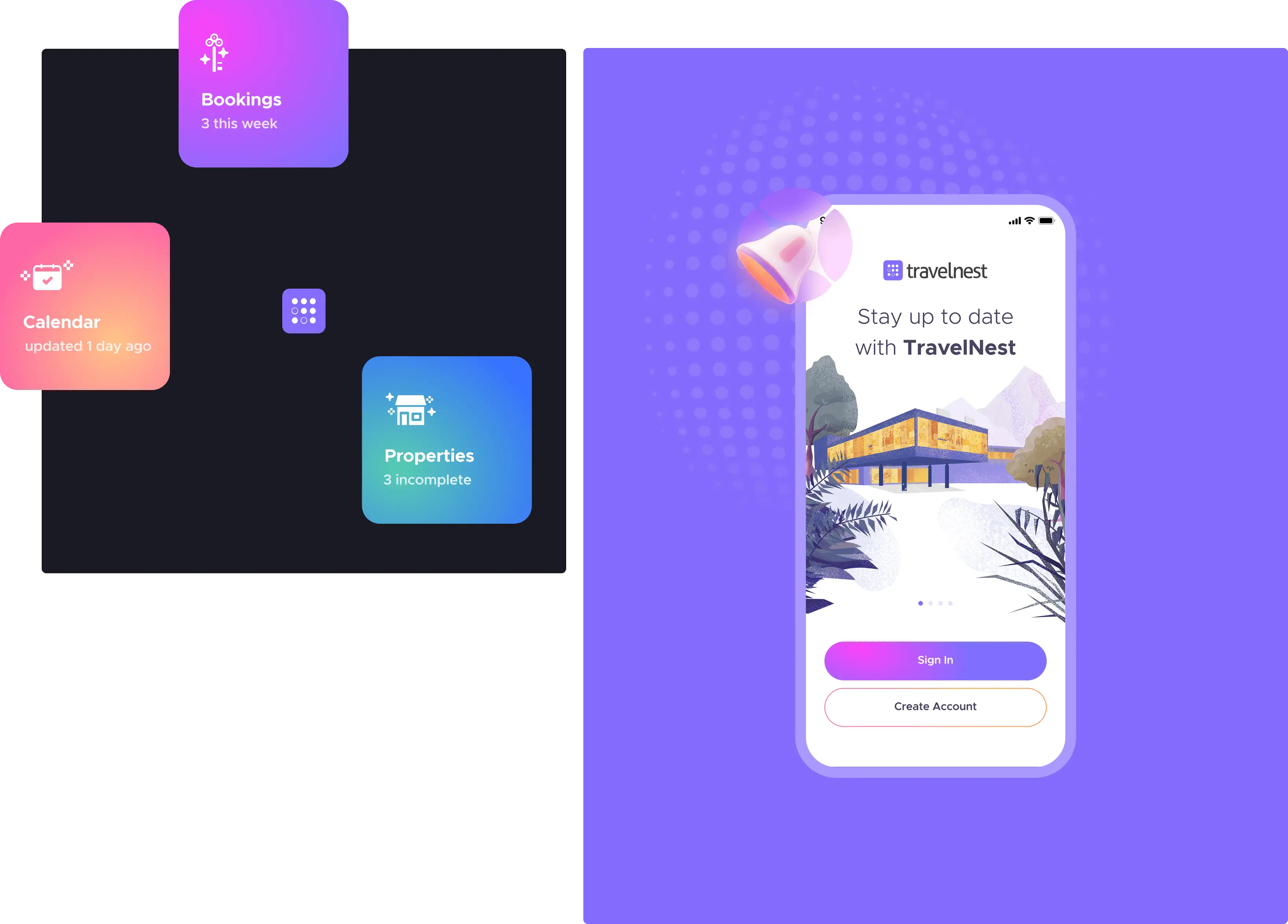
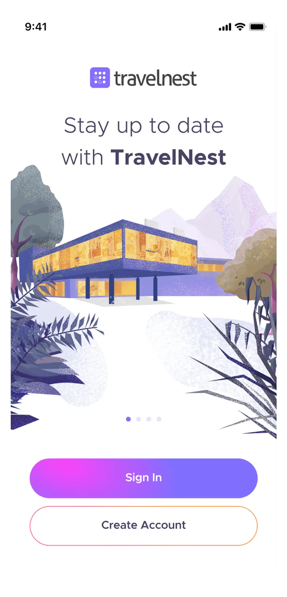
They approached me with the need to design a mobile application that would serve as a companion app to their primary web application. The design process also aimed to kickstart a brand refresh. For the MVP version, the app needed to have minimal features, but it was crucial to conduct an extensive analysis to ensure scalability and the seamless addition of future functionalities.
The Process Enabling Informed Decisions
While working on the TravelNest project, I chose to leverage selected exercises from the Google Design Sprint methodology to identify challenges and opportunities and define the app's scope effectively, keeping it as streamlined as possible. During the Discover phase, I conducted an in-depth market analysis, encompassing not only direct competitors but also applications (and it’s interfaces) integrated with TravelNest (such as Airbnb or Booking.com). Using techniques like "How Might We" and "Abstraction Laddering" was essential to understand the team's perspective on the app and the needs of potential users from various viewpoints and abstraction levels.
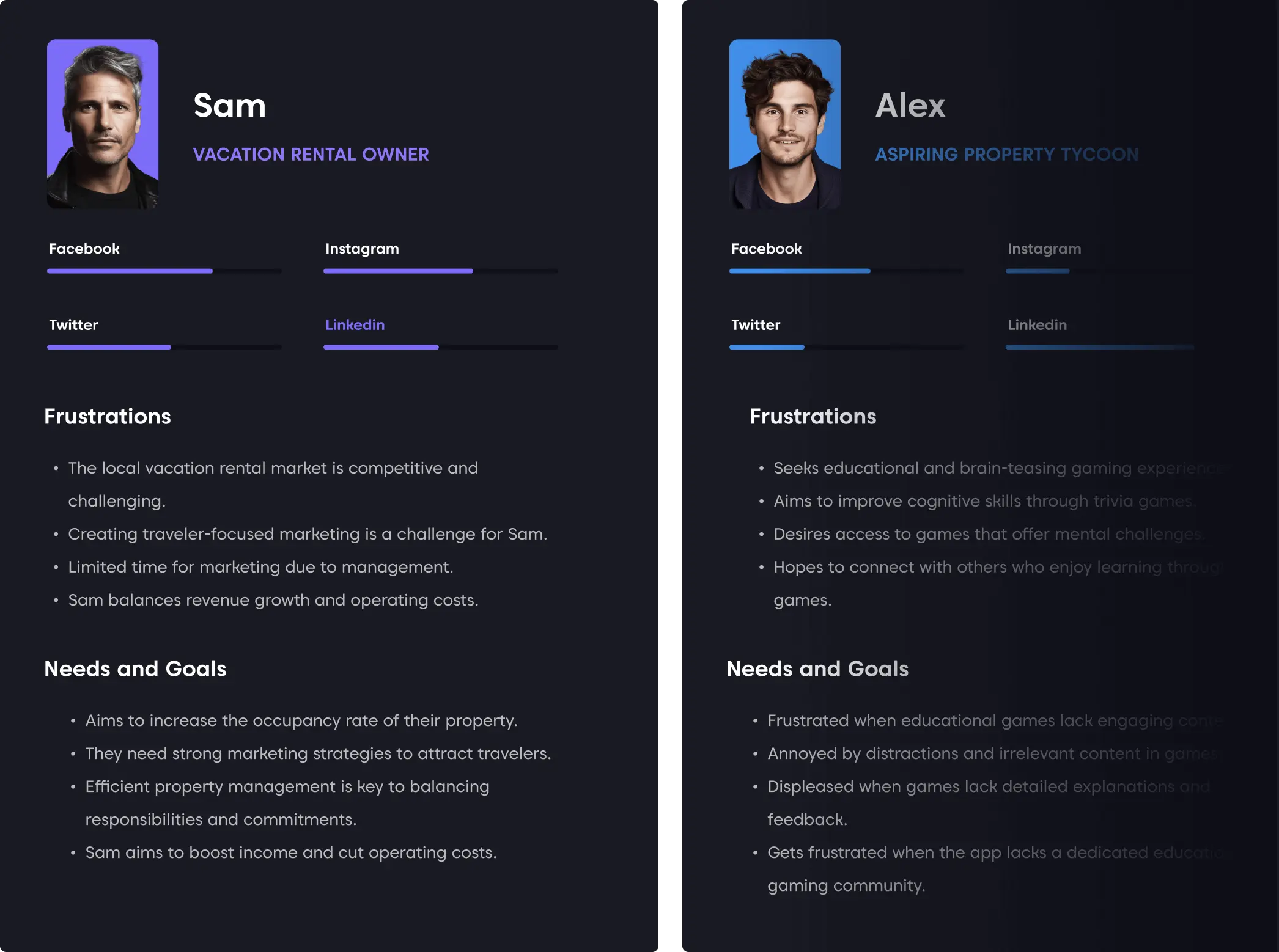
Building on this foundation in the Define phase, I could construct hypothetical personas and perform the "Consider Everything At Once" exercise, which allowed me to explore project from different perspectives. The final exercise involved creating the Golden Path, a crucial step in building the user flow, given that the MVP version of the app was significantly streamlined, with the Golden Path constituting 80% of the Application Map.
How Might We...
We used the 'How Might We...' exercise to analyze the team's perspective on the entire product. Since I joined as a designer when the web application was already fully functional, understanding the rest of the team's perspective was crucial. The second key objective of this exercise was to identify all potential opportunities that could be leveraged by both the application I was designing and the web application, as well as the entire product.
User personas as the main tool for finding the right scope.
In the case of this project, I chose to create detailed personas – both hypothetical in the initial project phase and real ones based on user research later on. This decision was driven by two factors: firstly, the application's design was intended to kickstart a refresh of the TravelNest brand, making it crucial to understand the users.
Secondly, because the mobile app in its initial release was meant to have minimal functionality for rapid development, creating well-structured personas was essential. Selecting the right features was critical to ensure the app attracted a sufficient number of daily users, which would, in turn, fuel its further development.
Simplified User Flow Integrating the Web App Simplified User Flow Integrating the Web App
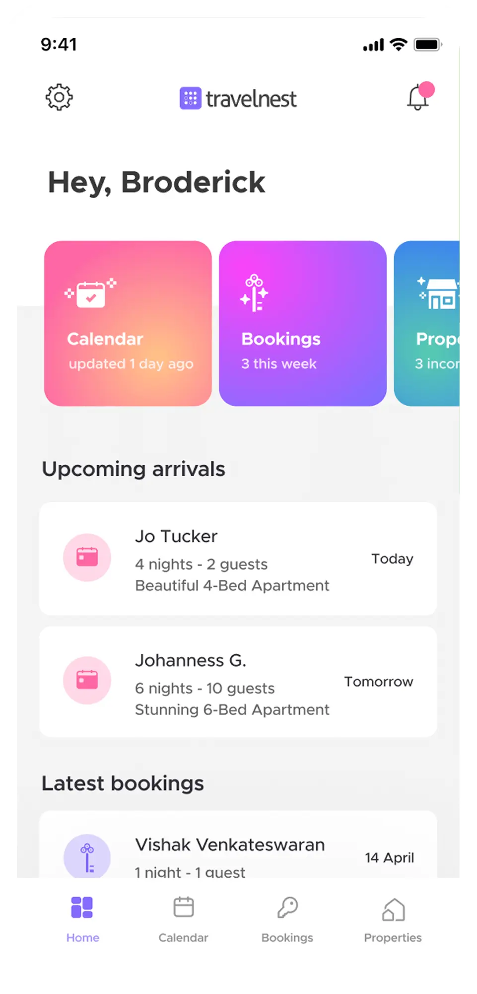
The application was straightforward and intended to serve as a companion app for the web application. Therefore, ensuring that the user flows were highly efficient was crucial. The integration of the web application in a responsive version allowed for a relatively easy expansion of user options. Even though this was a transitional stage, as the MVP was highly streamlined with future development in mind, it was pivotal for the success of the application in this form.
Wireframes using current trends.
The wireframes incorporated the knowledge gathered during research. The UX solutions were a combination of well-known mobile patterns, solutions from integrated applications that TravelNest users were familiar with, and custom solutions perfectly tailored to user cases.
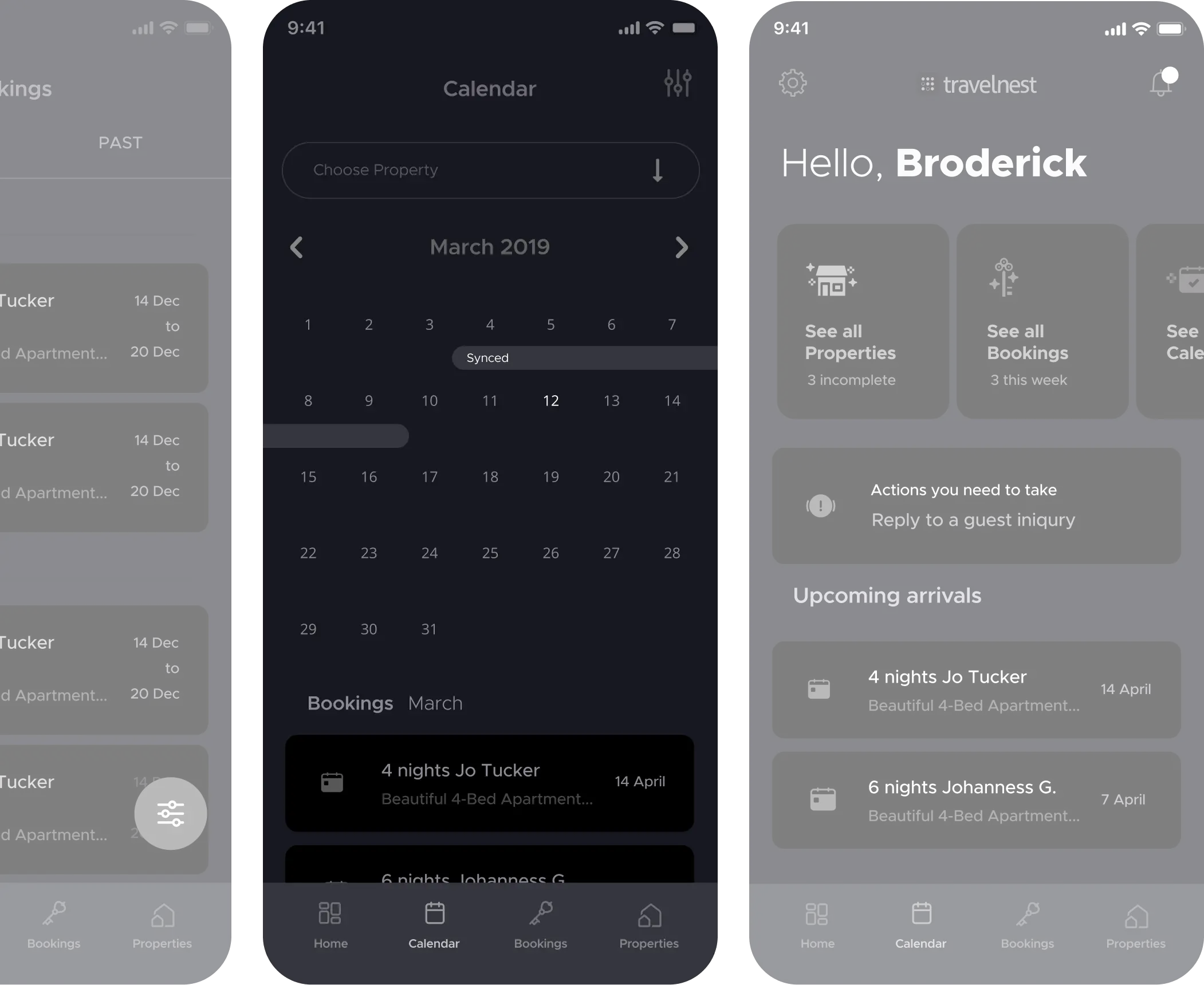
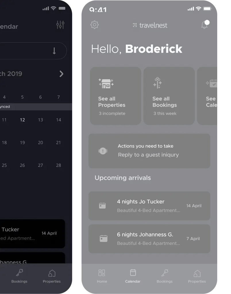

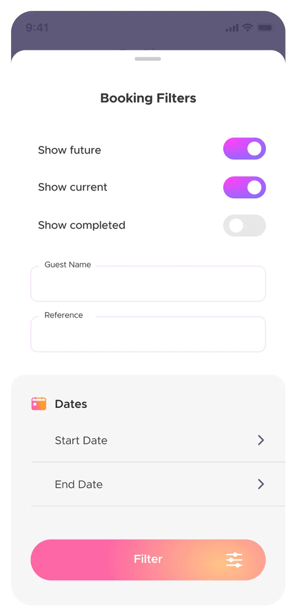
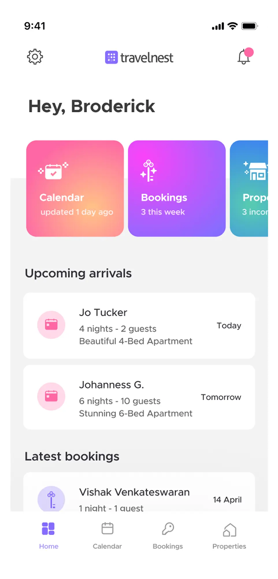
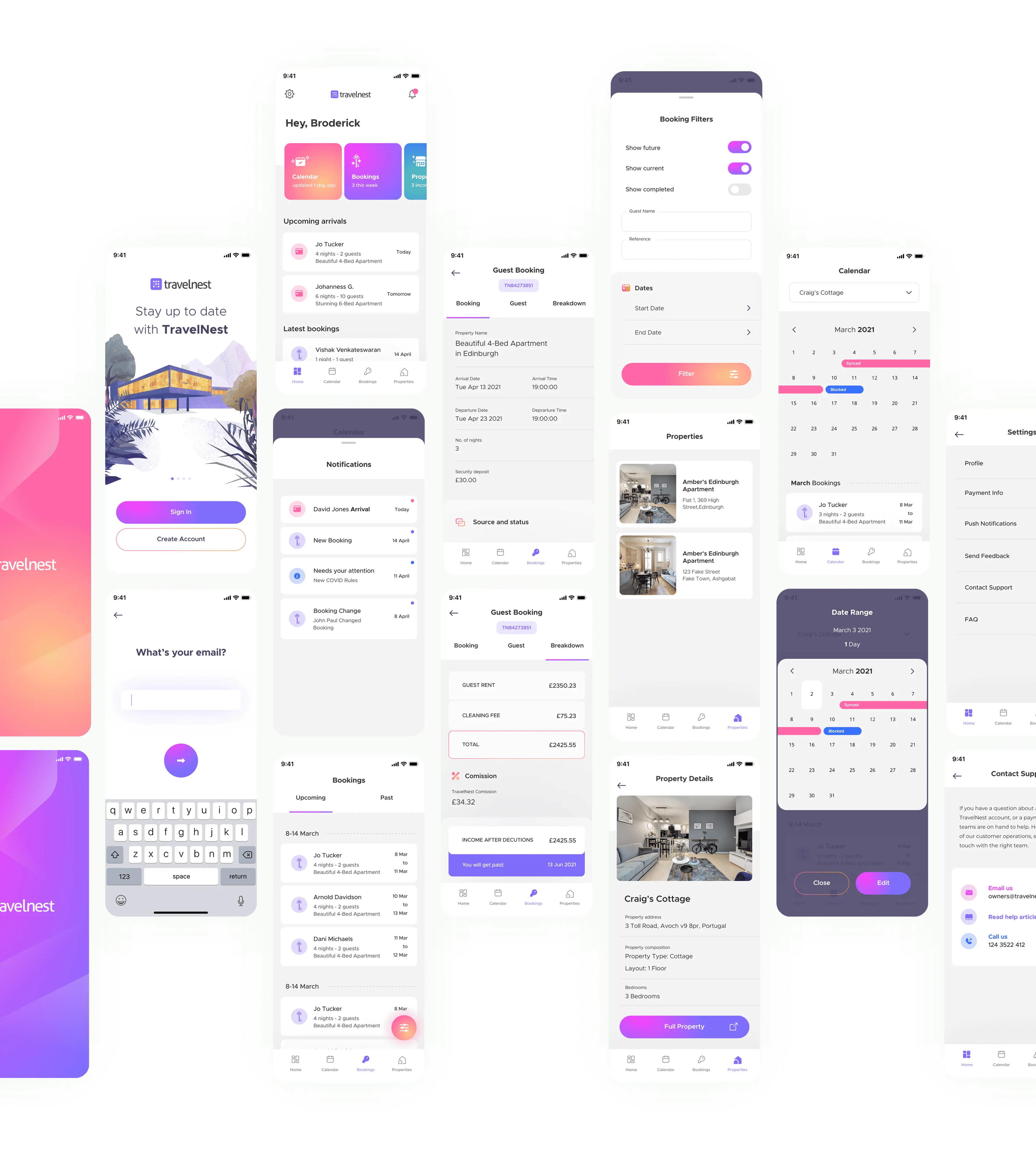
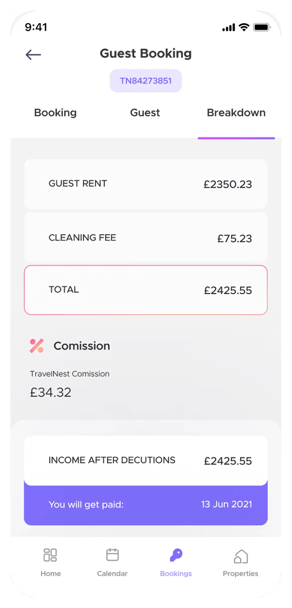
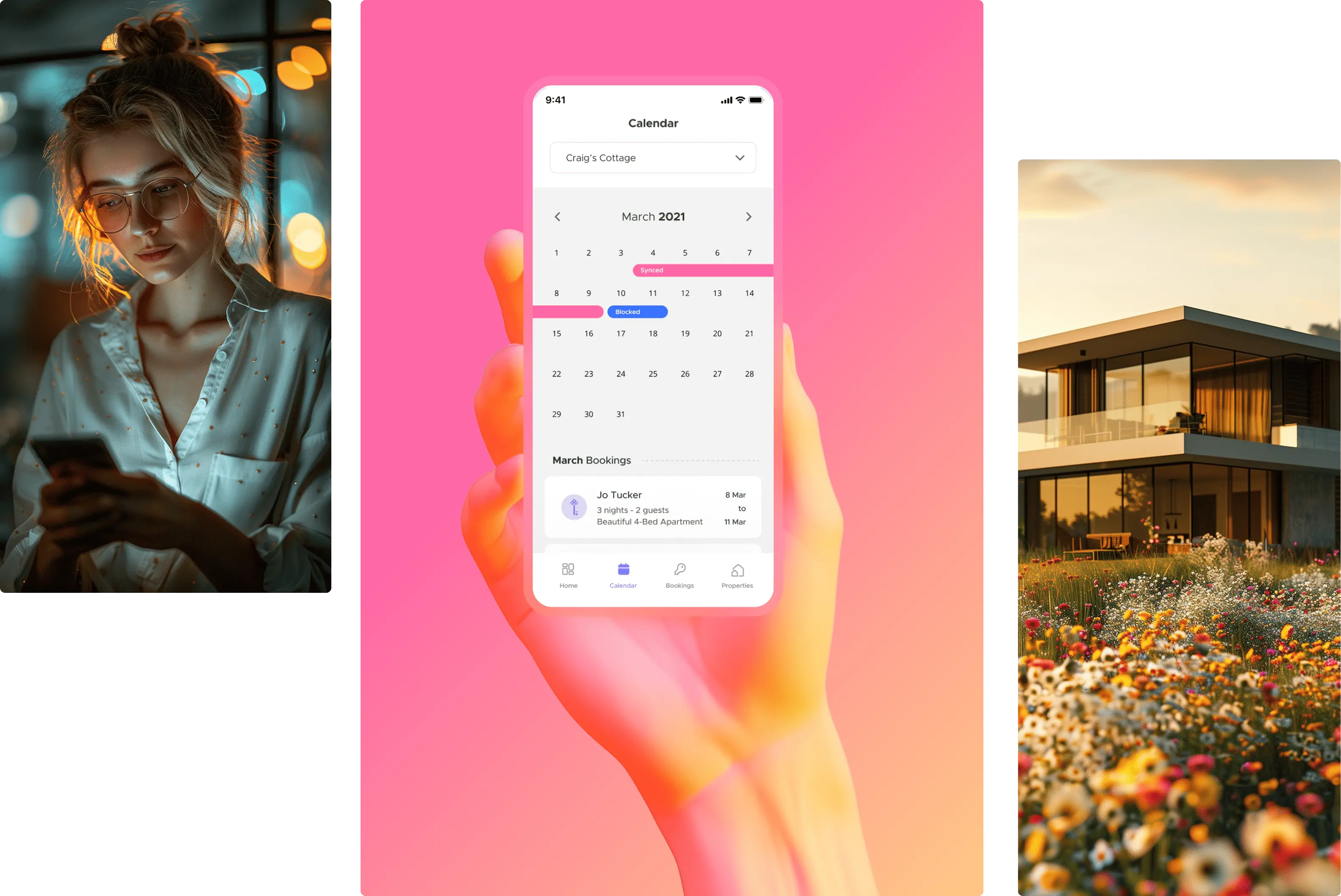
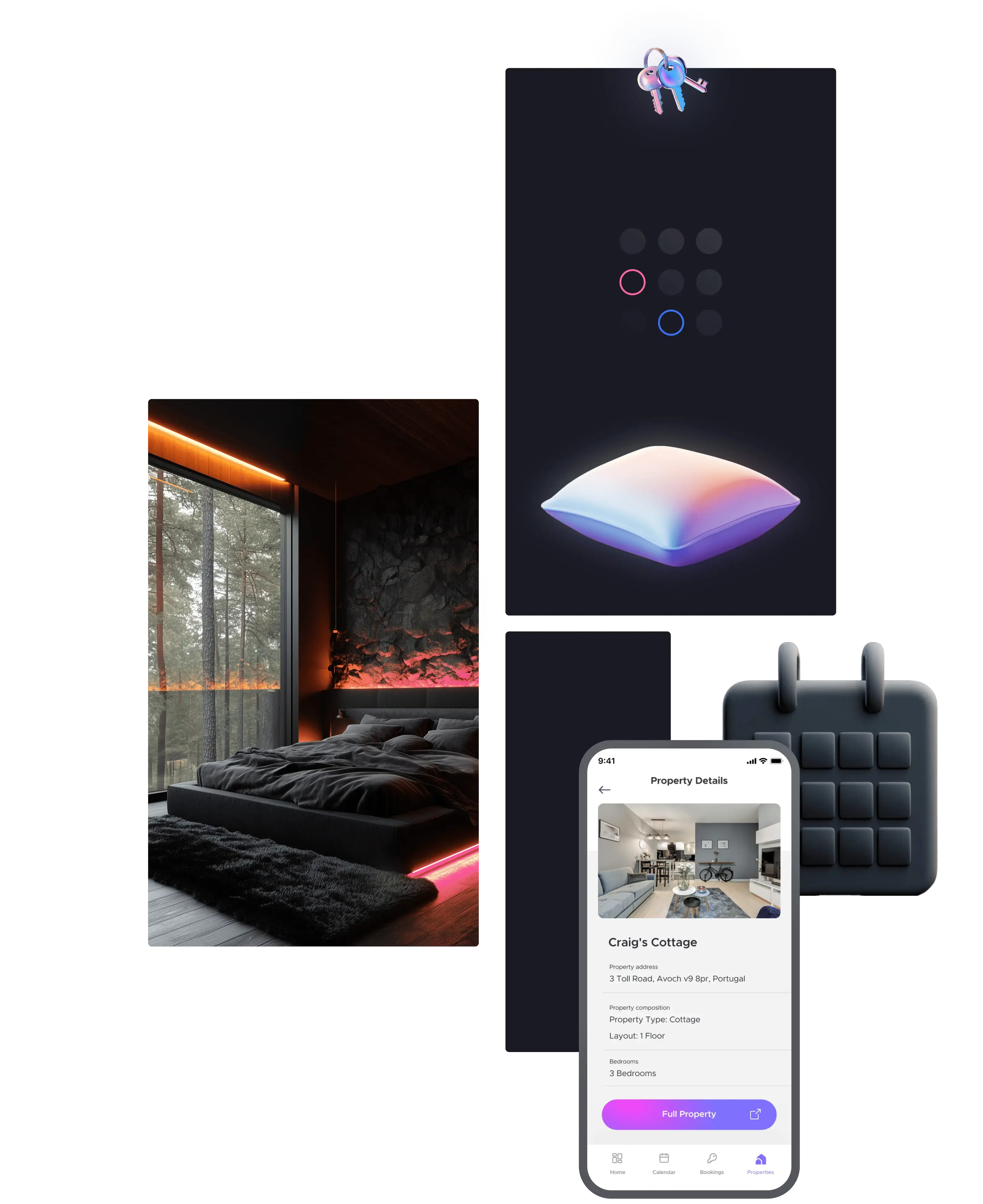
Calendar Experience
The calendar was the fundamental and most crucial functionality of the MVP version of the application. Swift calendar management was a highly requested feature by users. I designed a custom interaction to ensure a more cohesive user experience.
App Rating Experience
When the app is in its MVP version, positive reviews are crucial for its popularity. One of the tasks of the app was to generate buzz around TravelNest, which would translate into greater interest in the brand. Custom animations were intended to boost user engagement.